Animation acts differently despite same settings

Principle Version: 5.9
macOS Version: Catalina 10.15
Figma Version: Release 76 / Build 4
Screenshots/Sketch File/Principle file: (if applicable)


Description of what you need help with: I have applied the same exact animation to elements that should theoretically behave the same, but they are behaving very differently. When nothing is active and I tap C (dark blue) it behaves the way I want it to– it springs very quickly and changes to desired state (yellow w/ black text). The same animations were applied to active C (yellow), inactive D (dark blue), and active D (yellow) but they change much slower than C inactive to C active. Why is this and how do I change it?

Here is the setup:

  • 1 Board with all keys inactive (dark blue)
  • 1 Board with the pressed state of the C button (75% opacity; .9 scale)
  • 1 Board with the C button active (yellow)
  • 1 Board with the pressed state of the D button (75% opacity; .9 scale)
  • 1 Board with the D button active (yellow)

Mind sharing the .prd file so we can try and find the issue?

Yes sorry. How do I do that? I don’t see an option to attach a file or anything.

Try uploading it to Dropbox and sharing the link here.

Thank you!

Oh yes, I see the issue now.

If you notice the transitions from Inactive to either Pushed or Inactive 2 are short as you intended, so they jump quickly into next screen based on the Auto trigger you set up.

image

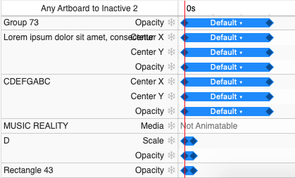
But when you are not in the Inactive screen, but in one of the others like Active or Tier 1: Grid view 3, there’s a bit of the transition that extends longer than that 0.3 seconds you intended, so that animation takes a bit longer, you can see it in the transitions called D Tap and C 2 Tap as the following image indicates.

image

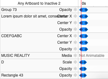
So shortening those keyframes to match the other ones located in 0.3, will make the resulting transition last as much as you intended.

image

So you just need to shorten those keyframes for the 2 animations I indicated and the desired effect is working now.

Here’s a video of how I fixed it: https://www.dropbox.com/s/o8dogukxe4jz1r7/animation-issue.mov?dl=0

In my opinion, you should try to use components, this will make things much easier and will avoid any effort of keeping several animations to be equal in a manual way.

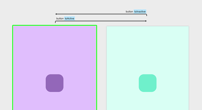
In this example, I’ve created a button component with 2 states (Active/Inactive) and with 2 auto messages once one of those states have been selected, that way you can call those triggers.

Then from outside of the components I can easily call the states and trigger a screen transition.

Here’s the result.

This way is much easier to maintain as all the buttons will be a same component, so animations will be all the same regardless of how many buttons/screens you have. Without mentioning the file being much easier to manage as it will include much less layers!

Here’s the .prd file to my example.

I hope it helps!

3 Likes

Wow. I really cannot thank you enough for such a detailed reply. I am very new to Principle and haven’t played around with components at all. I am going to try this in a little bit. I really, really appreciate it!

No worries! Glad it helped, it takes a while to learn the bits and bobs of components, but is a way better approach than having all out there in layers/folders, when the project grows (and it will), you’ll be swimming in a sea of layers trying to keep them all in line.

I recommend you doing some tutorials available in https://principleformac.com/tutorial.html although they are not too extensive, they will give you an idea of the basics, there’s more tutorials on Youtube if you need it.

2 Likes